FlatLife
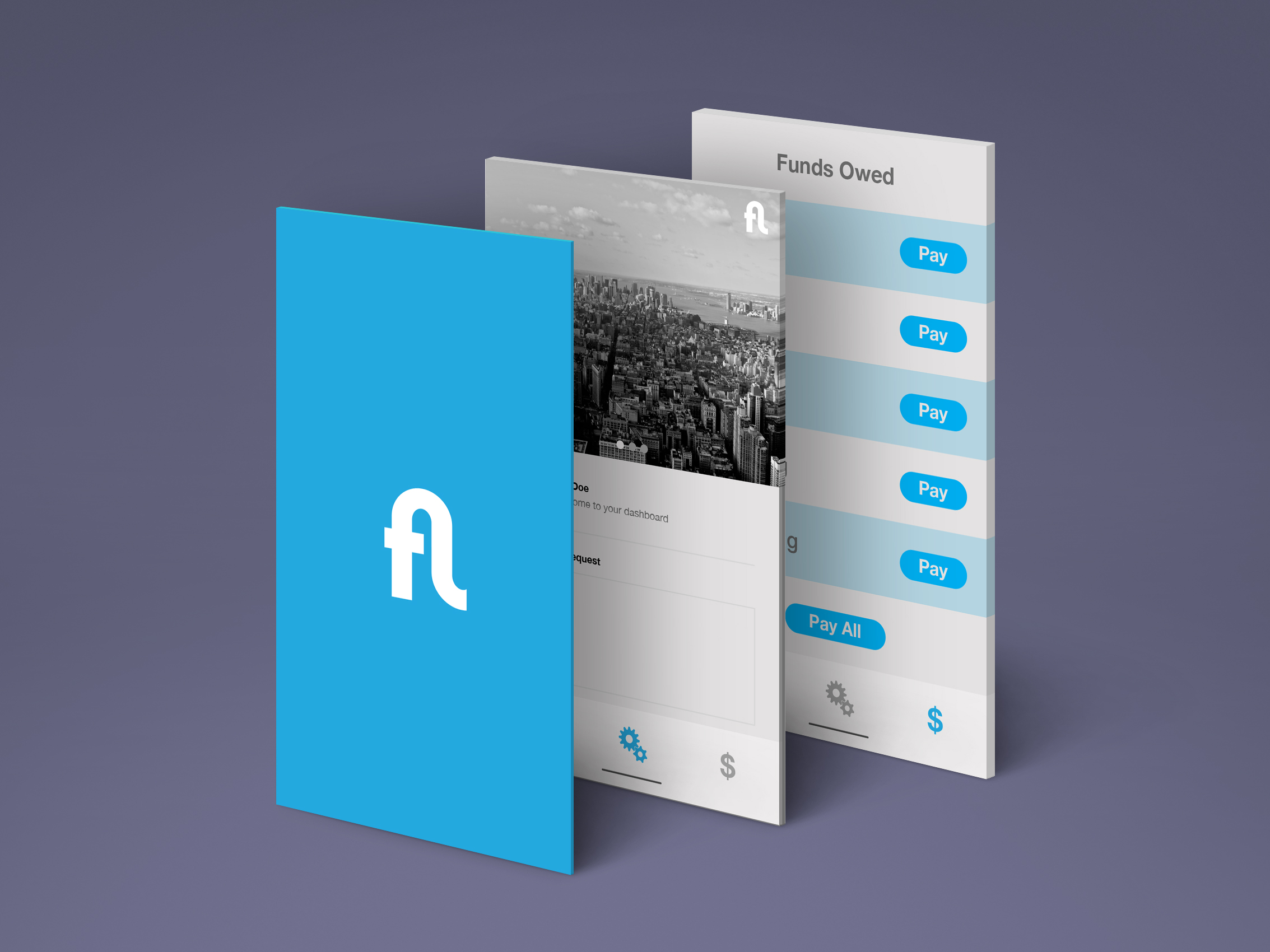
FlatLife is a tech startup transforming tenant–property management communication in urban apartment complexes. Tasked with creating a standout logo for their cross-platform app, the founders wanted an icon that conveyed both efficiency and ease.
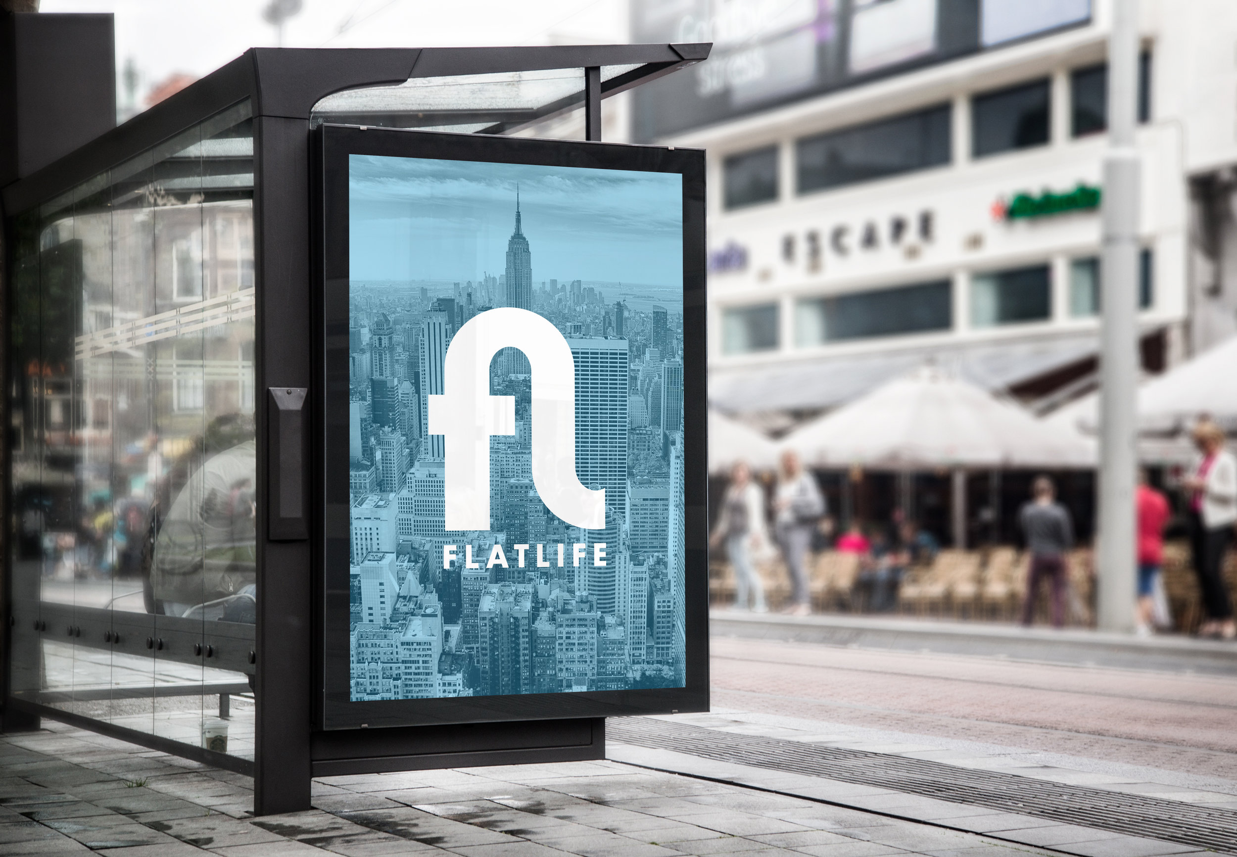
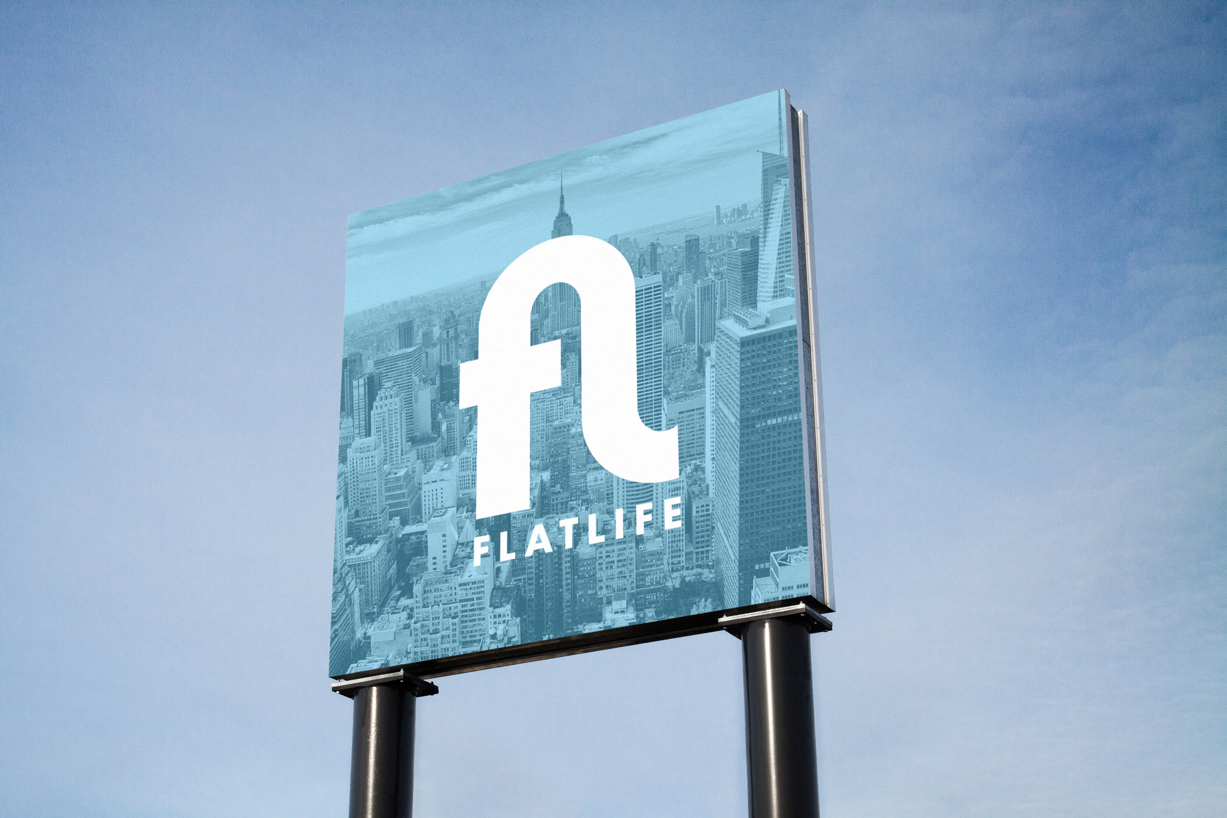
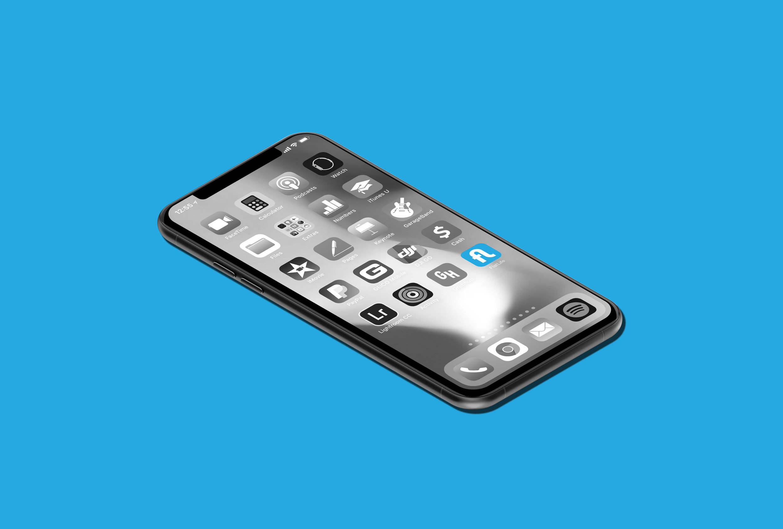
During the discovery phase, the idea emerged to form a custom ligature combining the letters "F" and "L"—a visual shorthand that embodies the seamless connection between tenants and managers. In an increasingly crowded home screen landscape, the icon needed to be bold, yet refined, and instantly recognizable at small sizes on mobile devices.
The resulting mark features a clean, geometric ligature: the top of the “F” flows effortlessly into the base of the “L,” forming a distinct and cohesive unit. This not only looks sharp at app icon scale but also provides a flexible brand element for broader marketing applications. The design reflects FlatLife’s mission: streamlined, intuitive service that integrates essential functions into one elegant form.