Amerlux
To reposition itself as a premium player in the commercial lighting space, American lighting manufacturer Amerlux engaged in a strategic brand refresh. With the logo already established, the focus shifted to reimagining the brand’s visual language—curating a refined system of imagery, textures, and advertising treatments that aligned with the elevated direction.
At the heart of the visual evolution was a bespoke set of textured patterns, inspired by the lines, curves, and materiality of Amerlux’s lighting fixtures. These patterns added depth and distinction across marketing collateral, while subtly referencing the tactile richness often found in luxury design across adjacent industries. The result: a flexible visual toolkit that reinforced the brand’s elevated positioning while maintaining a strong connection to its product DNA.
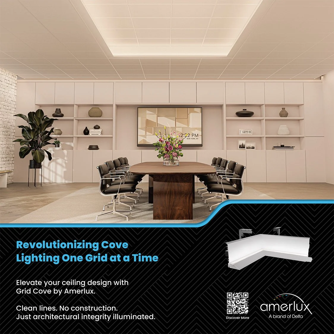
To reflect the company’s expansive custom capabilities—backed by a robust manufacturing facility—the advertising strategy embraced aspirational storytelling. High-end architectural photography and AI-generated visualizations were used to portray bold, elegant spaces lit by Amerlux products, designed to spark imagination and possibility in the minds of the architects and interior designers the brand serves.