
MMCC
Marcus & Millichap Capital Corporation, the firm’s financing division, needed a more contemporary visual presence that remained connected to the larger Marcus & Millichap brand.
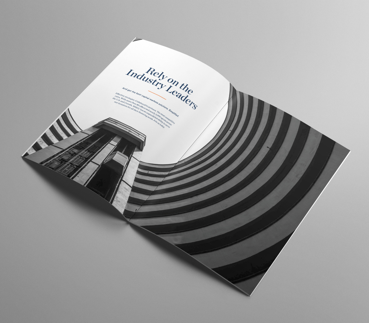
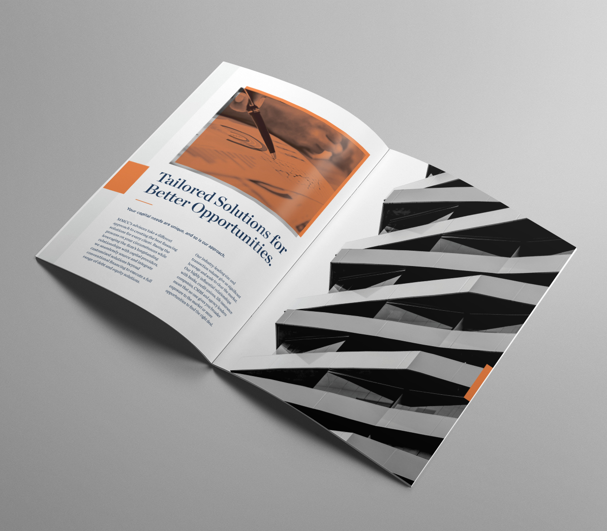
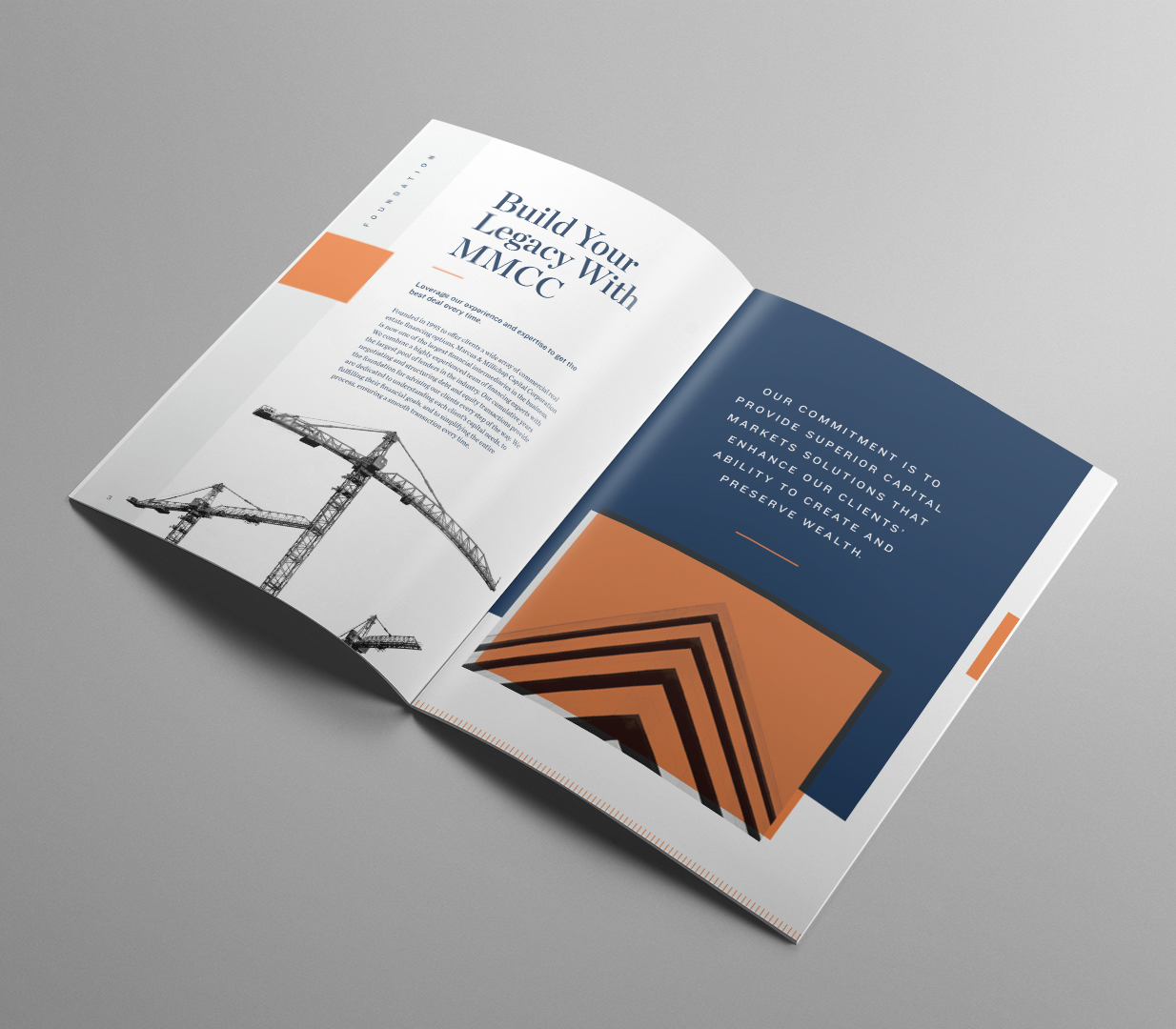
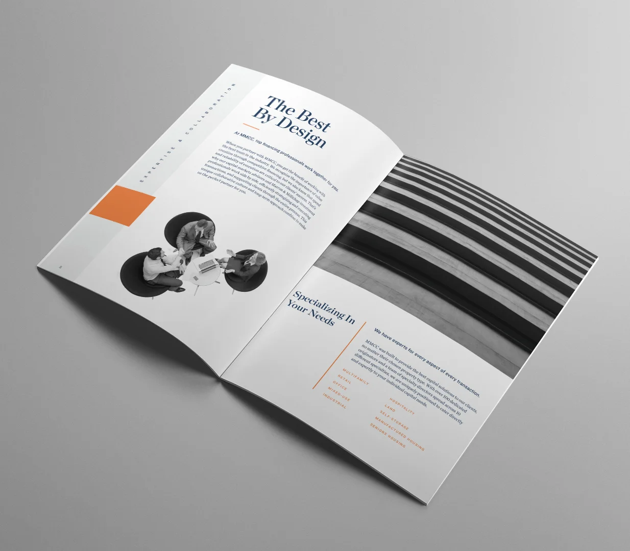
I led a visual refresh that strengthened that relationship while giving MMCC a clearer identity of its own. The system shifted orange into the primary role, distinguishing the financing division from the parent company’s blue-led communications.
A new typographic approach paired serif and sans-serif typefaces to bring greater range and hierarchy to text-heavy financial content. Bold, high-contrast imagery—often treated in grayscale with orange and blue overlays—created a more recognizable visual language across the division’s communications.
The resulting system modernized MMCC’s presentation while preserving the credibility and recognition of the Marcus & Millichap brand. It provided a more cohesive foundation for marketing, business development, and financial communications.