CMIT Event Booth by Jon Yoskin

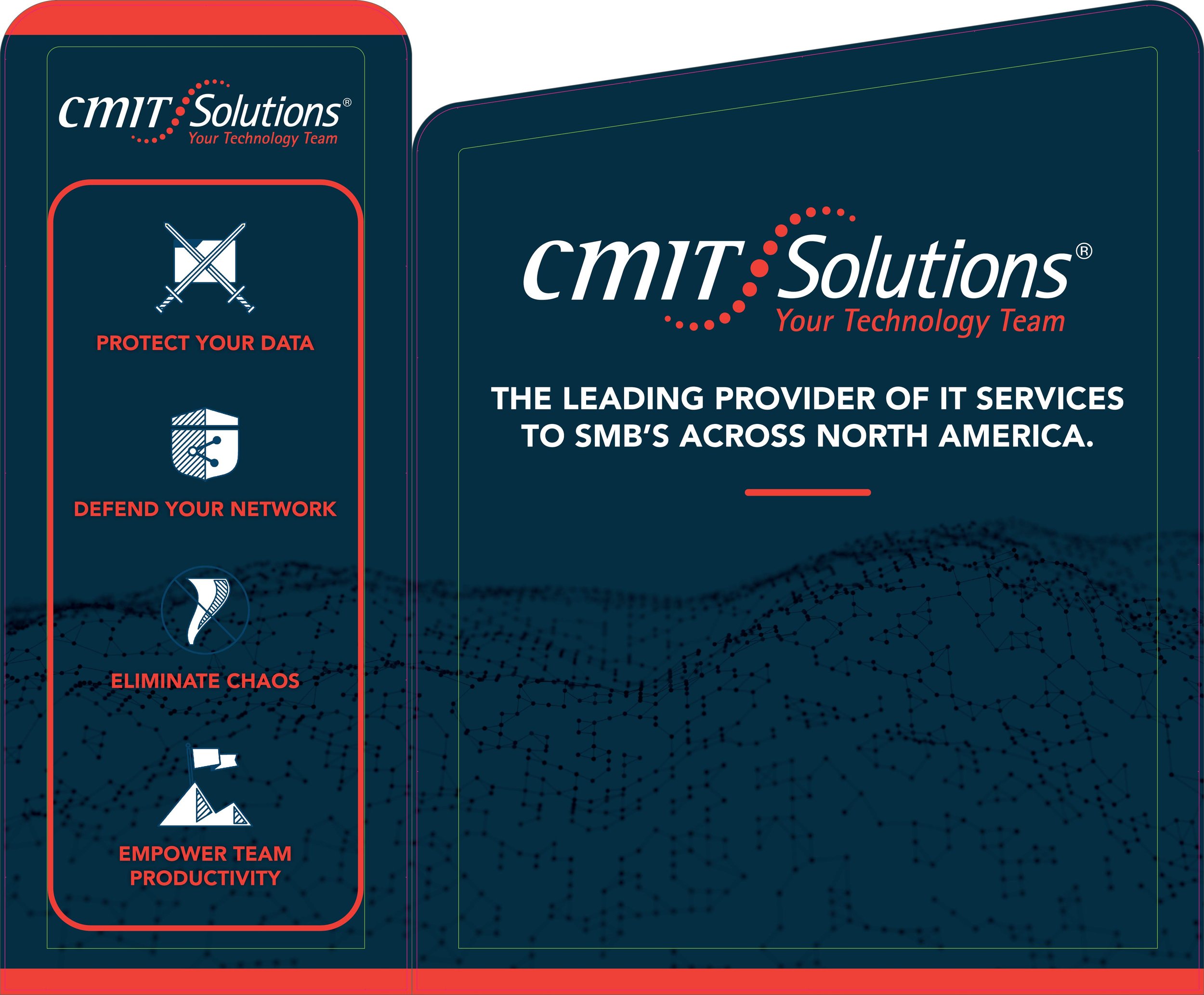
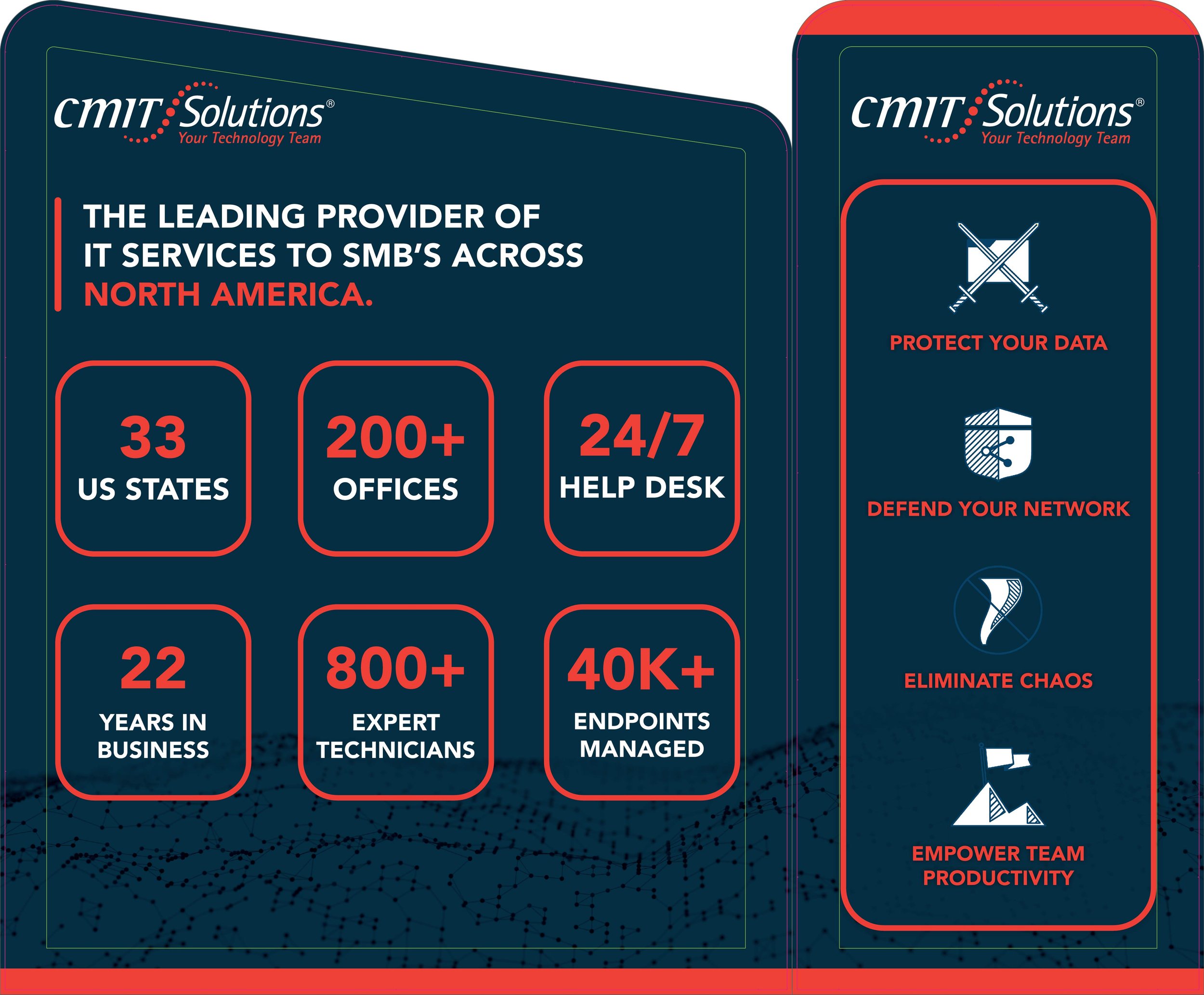
CMIT Solutions Beverly Hills tasked me with developing a visual identity for their Southern California franchise, as well as designing a tradeshow booth that could be used for various business conventions and events. By employing a limited color pallet pulled from the company’s logo and bold typography, I was able to build a striking look and feel that aligned with CMIT’s ethos. For the event booth design, I curated digestible evergreen information about the company that would complement the information being given by company personnel manning the booth.

disciplines

    — spatial design
— layout
— branding

Marcus & Millichap Capital Corporation Brochure by Jon Yoskin

The Marcus & Millichap Marketing Design Team was tasked with developing a capabilities brochure for the financing branch of the company, Marcus & Millichap Capital Corporation. This exercise was used as an opportunity to breath new life into a brand that had seen little to no change in its visual look and feel since its creation in 1995. Through the use of geometric imagery, clean typography and a healthy amount of negative space our goal was to create a refined piece of collateral that aims to mitigate an otherwise daunting introduction to finance within the commercial real estate industry.

Creative Direction from Quinn Killick and Larry Gonzalez

disciplines

    — design
— layout
— branding

MMCC_BrochureMockup1.jpg

Marcus & Millichap Company Overview by Jon Yoskin

The Marcus & Millichap Marketing Team was tasked with developing an interactive company overview that M&M sales agents could use as tool at conferences to win new business and convey to prospective clients what capabilities and services M&M has to offer.


disciplines

    — digital design
— layout
— information design

Super73 Valley by Jon Yoskin

In my free time, I love to zip around The Valley on my Super73 electric motorbike. Most company-sponsored community events take place far away from where I live so in an effort to create a small community around something I am passionate about closer to my home I organized a small event to bring local e-bike enthusiasts together. I created an Instagram tile and accompanying Instagram story post to generate interest and awareness. Notably one of the attendees came all the way from San Diego to participate in the meetup.

disciplines

    — design
— layout
— social media

Iphone Backgrounds by Jon Yoskin

Contemporary backgrounds designed for the Iphone X with an emphasis on the simplicity and beauty of the geometric form.

disciplines

    — design

Jetty by Jon Yoskin

During my time at Jetty, as an assistant to the creative director, I was tasked with developing various graphics for the company's apparel lines. These projects included graphics for seasonal lines and a capsule line, to be sold exclusively in Jetty's flagship retail location.

disciplines

    — design
    — apparel design
    — illustration


The Diver Skull Tee was created for the Jetty Spring/ Summer 2016 Line. This shirt became a seasonal line best seller and was acquired for online distribution by Tilly's.

Due to the successful sales of the Spring/ Summer 2016 run of the Diver Skull Tee, Jetty decided to run the design again in a new color way for their Spring/ Summer 2017 Line. The Diver Skull Tee was also featured in a video on Jetty's Instagram.


The Starboard Line was created to be sold exclusively at Jetty's flagship retail location. The goal of this line was to develop a series graphics that paid homage to the companies roots. The line incorporates graphics from the companies archives that were taken out of retirement and refreshed as well as new, original designs that align with the brand aesthetic and local Long Beach Island culture.  


The Starboard Line Look book


The Rocket Dog Tee was created as part of a limited edition Fourth of July capsule line during the Summer of 2016


Flat Life by Jon Yoskin

Flatlife is a financial technology company with a focus on real estate to revolutionize the way tenants and property managers communicate and work together. The client's main request for the FlatLife logo was that it look "modern." By creating a design with sleek flowing curves and employing a color palette that is on par with the technology industry, the logo became an accurate reflection of the brand feel.

FlatLife provides a residential management solution for organized property managers using a convenient and reliable interface helping you feel efficient and in control of your assets.  

disciplines

    — branding
    — logo design
    — wireframing/ interface design


Rad Fox by Jon Yoskin

Rad Fox is a film production company. The clients were looking for a logo that incorporated a geometric representation of a fox with quirky details that referenced the film aspects of their brand.

disciplines
    — branding
    — logo design
    — illustration


Aaron Rizzo Music by Jon Yoskin

This illustration for Aaron Rizzo Music was created for promotional purposes geared toward social media as well as printed promotional stickers. For the aesthetic of his logo, the client wanted to be reimagined as a "minimal comic book super hero." 

disciplines

    — branding
    — logo design
    — illustration


Over It! by Jon Yoskin

Over It! podcast represents a discontent with the status quo encouraged by mainstream society and media. It states an unwillingness to accept what is being offered and an interest in exploring opportunities for deeper discussion and change. The clients requested that two crossed forearms (a universal sign for, "enough is enough") be incorporated into the design. The goal of this logo was to create a design that is refined and to the point in order to match the brand culture.

These assets were created to initially populate Over it! podcast's social media channels. Assets include square tiles for instagram and cover photos for Facebook.
 
disciplines

    — branding
    — logo design
    — social media


Steph's Kitchen by Jon Yoskin

Steph's Kitchen exists within a local food delivery service based in Melbourne Australia. Steph's Kitchen provides locally sourced and healthy food options to customers in the community. The color pallet of this logo was inspired by foods that would be found in a garden in order to align with the brand identity.

disciplines

    — branding
    — logo design


Windsor Knots by Jon Yoskin

Windsor Knots was a start up apparel company that looked to create clothing on par with companies such as Vineyard Vines or Southern Tide. The client wanted a refined yet progressive take on a monogram that conveyed attibutes of quality and heritage.

disciplines

    — branding
    — logo design